Sunday, 8 November 2009

Web Design Screenshots

I created my web site design in Photoshop and then using the slice tool to create the dimensions of the buttons and interactivity in the website then selecting the and combining the slices which weren’t necessary as separate slices.
I opened the html file in Dreamweaver that I had saved as a web file in Photoshop.


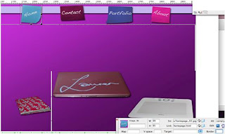
Then selecting the one of the slices which was a sticky note then in the properties box adding a link to the page; I did this on all sticky notes and all web pages and saved them. I did his to have a consistent design element through out of web design and also so it was easy to go to different pages and not have to keep pressing the back key and having to keep going back to the homepage to get anywhere on the website.


At first when I added the link a white space appeared on the design as seen above. So I went back to the properties box and typed ‘0’ in the border box this is so there will be no space left there and will give a cleaner look on my design.
I also wanted the homepage to have the images to be hover over buttons to the different pages so they added to the interactivity. I selected the laptop slice in Dreamweaver and on the insert tab I inserted a rollover image. I then selected the images I wanted and added text so it was clearer on which page it would be linked to this is for the viewers. I had already changed the original picture within the slice in Photoshop by changing the hue/saturation and making it extremely light so it was much more obvious what was being hovered over.


I then added the URL which was the next page in this case it was the contact page and pressed okay. I then found similar to before where I had to type in ‘0’ for the border which I first tried but it didn’t; I then tried deleting the original image and viewed it and it was now working properly, I then did this for the other two images on the home page.
Animation Screenshots


At first I overlapped each of the different photos in Photoshop then just dragged them onto the first image in my animation making sure they were all properly in place I then created a new layer within the animation and for every layer I had for my photos I created an animation layer then I selected/deselected the layers for each of the animation frame so it wasn’t the same image throughout.


I then added a filter onto each layer; I chose watercolour because it made the photos look older and darker which I wanted my animation to be like so it was like an old heirloom or a old photo album which had damaged and badly taken photo graphs in there even though they were blurred and not very clear.


I used the same technique for each of the animations but blurred them slightly as I wanted them to look older and spur of the moment type of photos which I always prefer to look at when looking at photos instead of a posed photograph.

Digital Story Screenshots - Final Cut Pro


I first imported my photos and sound recording within final cut pro and began inserting them into the timeline I did this by dragging them into place.


At first I decided to cut up the sound recording so it gave a better effect so there were pauses to create more suspense and the main focus was on the photos; I did this by selecting the timeline bar and moving it to where I wanted to cut the recording then pressing the tool It divided at the point I wanted I then placed it where I wanted it. I placed each photograph where I wanted them also by extending the photos so I could have them longer than they originally were by just dragging out the sides.


I then decided I wanted the photos to move into each new photo so it was a smoother transition I did this by selecting in between two photos and then selected video transitions and decided on using additive dissolve as I felt it was a plain effect and it didn’t take away from the photographs but added to the effect.

Animation Evaluation

For this project we were asked to create a effective animation about ourselves. I decided to create a photo album which free standing and had moving photos with in while turning the pages I wanted it to look old much like an old family album or heirloom.

I wanted to show what I always think of when I think of a photo album which is lots of blurred and spur of the moment photographs. My intended audience were my tutors and future clients to demnonstrate that I can create an effective 3D animation.

I experimented with different ideas such as whether to add a character into my work and I photographed a keychain that I could have used but I decided I liked the idea of just having the book open free standing would look alot creepier and surreal.

I feel I could have managed my time a lot better, so I could have created a more fine tuned animation and having more indepth research to help with my animation.
My strengths for this project was by using final cut pro and using several tools which I had not used before and I strived to use them effectively such as the skew tool which was a main part in my animation.

I would have liked to have used my time more effectively so I could have created a longer animation and tweeked and experimented more with my animation. This is something I will improve for my next project by making sure I have met the set targets I will set myself for each week.

Digital Story Evaluation

Digital Story Evaluation

We were asked to create a visual interesting digital story about a family story which I feel needs to be told. I first started by creating mindmaps to decide which story would be most effective in a digital story.
I created a digital story and created several of the photos and added effects. I wanted to communicate an effective story and be able to use the tools in final cut pro well and effectively so I tried using transitions as well as using the cutting tool.
My intended audience were my tutors as well as future clients to demostrate I can use final cut pro effectively.

I used watercolour paints again for my media experiments, it became the water although it may not be as obvious as the opacity and has been lightened alot but I liked the effect it gave. I think by using watercolours really demostrates the fluid motion as well as it being a water based paint so it does resemble water more than usual paint or other materials.

I tried to ensure that I had used a mix of different tools in Photoshop and final cut pro; I tried to experiment in final cut pro because I have not used this programme as much as Photoshop.
I feel my time keeping needs to be improved in my next project I intent to make sure I review my work every week making sure I have achieved at least the minimum I have set myself for that specific week and hopefully that will help me strive towards better standards of work. - This is a main thing I would have changed my time keeping. Additionally I would make sure all my photos were of good quality and took more time to manipulate them so they looked more effective.
My strengths for this project were that I had a strong idea for this project, I also like the way the final product goes together with the transitions.

Web Design Evaluation

Web Design Evaluation


For this project we were asked to create an interactive website based around our personalities and interests. I began by researching into interactive and well designed websites to help me explore different options for my website.

I have presented a simple website which shows some of my previous work; I feel it could include more interactivity but I like the simple features and it isn’t cluttered and complicated. I think what I wanted to communicate was that I always use my laptop and really like being creative. I like the quirkiness of the pages with the pages of the zoomed in versions of the images I especially like how the about page has turned out as I really like how the design and it looks like it could actually be my journal/diary.

My intended target audience was future clients, peers and tutors to show case my work the age group is approximately 18 – 50 which is a vast age range but I feel my website is suitable for all.

For my material experiments I used watercolours for all my projects, because I am currently fascinated by the paintings done in watercolours. I was going to use flowers created by watercolour but I like the idea of having my desk as my main design.

I think my time keeping needs to change; I feel I could have done a lot more on my website such as more interactivity, for the next project I will ensure I have a minimum amount of work done for each week to ensure I can have more detailed work.

Sunday, 1 November 2009

Photographers Rights

People and Privacy
UK laws are fairly vague when it comes to defining what constitutes an invasion of privacy, but while street shots should cause no problem, you might get in hot water if you're strapping on colossal telephoto lens and zooming in on folks stripping off in their bathrooms - even if you are snapping from a public place.
The key seems to be whether the subject would have a reasonable expectation of privacy - a statement that seems vague enough to keep a team of lawyers gainfully employed for some time.
With some countries having stronger privacy laws, UK snappers looking to commercially exploit images of recognisable people snapped without their consent may find international clients unenthusiastic unless a model release has been obtained.
There's also a remote chance that photographs of people in public places may be subject to the Data Protection Act, but that's pretty unlikely if there's no other identifying information accompanying the image.